
Honest photography and a 19th-century illustration technique affirm the craft of fishmongery for a new certification scheme.


An ancient City Guild, The Fishmongers’ Company has upheld standards in fish trading for more than 700 years. The Company recently created certification to celebrate professional excellence and, in turn, encourage the public to support their local fishmongers.
The first Master Fishmonger Standard materials were concerned with very functional application information. To leaven it, great visual content was essential.
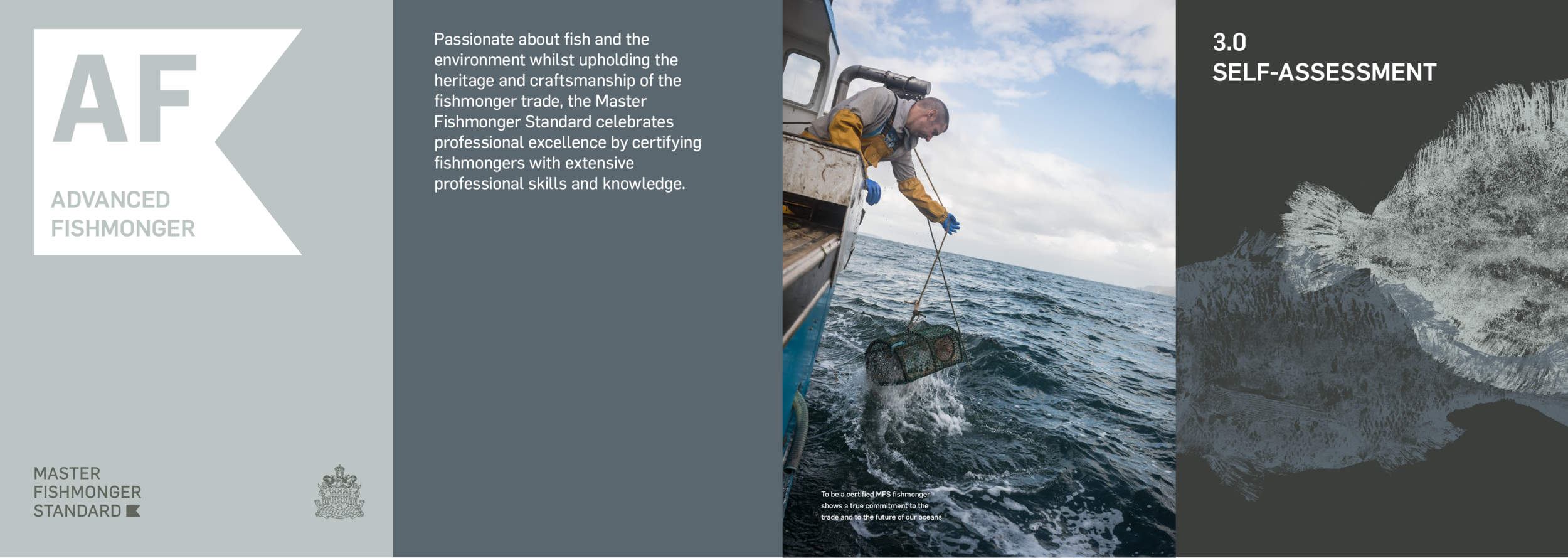
Fly-on-the-wall photography captured the people involved at all stages of the production cycle. With the help of photographer Reuben Paris, we sought to capture the noticeable pride all our subjects had in their work, and the real sense of knowledge being handed on to new generations. But an identity supported by photography alone risked feeling generic.


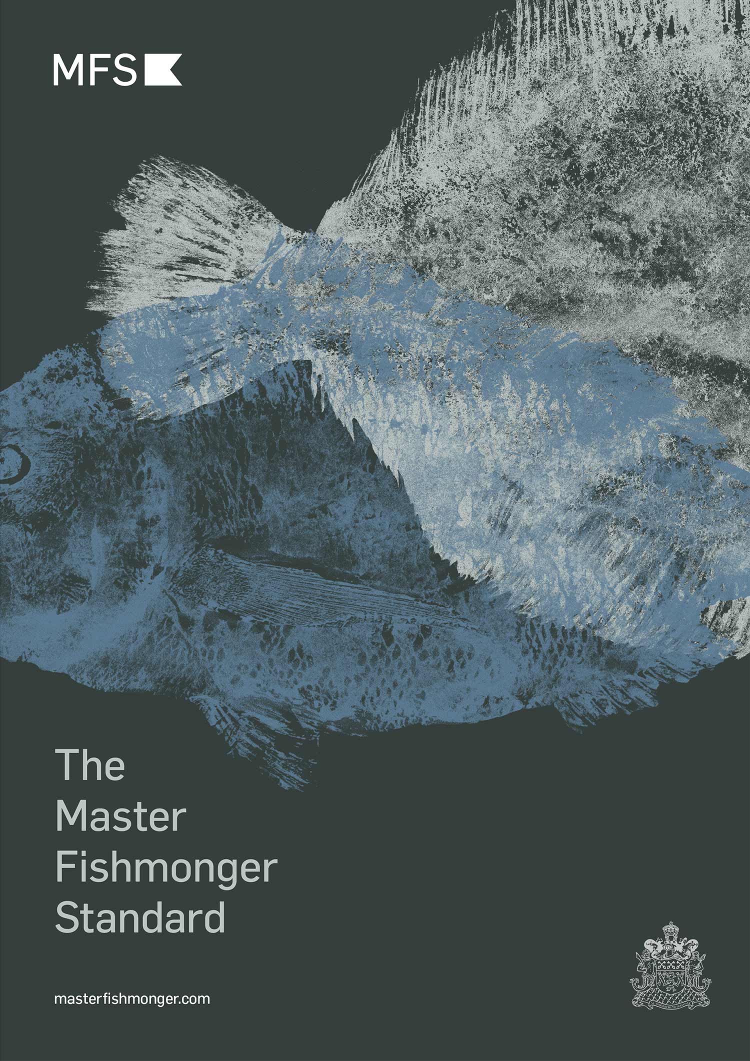

Gyotaku printing
At one time Japanese fishermen used rice paper and pine-soot ink to ‘print’ their fish and record their catch; eventually the prints evolved into their own art form. We used this gyotaku technique to create exquisite fish prints in-studio, layering different colours to create a true and contemporary graphic language that would tie together all aspects of the brand. The delicate details of fish anatomy hinted at the skill required in its handling, at the same time bringing softness to the naturalistic photography and restrained nautical marque. Buoy orange and shifting shades of blue made up a palette inspired by the sea.


Photography and prints are already in use, breaking up the practical text in MFS brochures and on its website. They’ll be carried forward across forthcoming marketing literature.


Project insights
